Turning 22 Years of ATUS Data into Time-Use Visualizations
Contents · 20 sections
- Project context and privacy
- The question behind the project
- Project highlights
- The data problem appeared before the first chart
- How the pipeline brought the years together
- The quality check that protected the joins
- From activity codes to meaningful categories
- The visual story moved from totals to patterns
- What the project delivered
- The lesson that transfers to other Python projects
- Method note
- Frequently asked questions
- What dataset did the project use?
- Why was schema harmonization necessary?
- Why include people with zero minutes in a category?
- What is the difference between an ordinary and weighted average?
- What does this project demonstrate?
- Who completed the technical workflow?
- How was the student's privacy protected?
- Source and editorial note
How a Python project handled changing survey files, validated joins, and built a visual story from public data.
Data source: Bureau of Labor Statistics American Time Use Survey
Project type: Multi-year Python data preparation and visualization
Project context and privacy
An anonymized master’s student at a university in Texas approached the team with this Python data-analysis project. The brief involved combining annual survey files, handling schema changes, validating respondent-to-activity joins, and producing visualizations by sex and age. The student’s name and university are not identified. This case study does not claim a student grade, testimonial, or unsupported business result.
Samuel P. completed the technical workflow and documented the data-ingestion process, join validation, category mapping, and visualization outputs. His profile describes 8+ years of production Python experience across pandas, scikit-learn, PyTorch, TensorFlow, FastAPI, and Hugging Face.
The question behind the project
How do people divide a day across services, leisure, volunteering, communication, and other activities, and how do those patterns differ by sex and age? This project set out to answer that question with the American Time Use Survey (ATUS) and recreate the visual clarity of an NBC-style data story.
The assignment combined statistical thinking with practical Python work. It required a pipeline that could acquire yearly files, understand their differences, preserve the information in each release, and turn millions of activity records into charts that a reader could understand quickly.
Project highlights
| Project detail | Result |
|---|---|
| Data source | American Time Use Survey, 2003-2024 |
| Tables | Activity, respondent, roster, and who records |
| Schema audit | 88 raw files, 222 unique column names, 62 changed table-year schemas |
| Activity layer | 4,880,021 rows across 33 aligned columns |
| Join validation | 7,669 of 7,669 activity and respondent IDs matched in the 2024 test |
| Visual output | Seven figures covering gender, age, distributions, correlations, and time shares |
The data problem appeared before the first chart
ATUS arrives as separate yearly files. Each release contains activity, respondent, roster, and who records, and the columns change over time. The project began by reading the headers across the collection instead of treating the files as identical copies.
The schema audit read 88 raw data files and cataloged 4,695 header entries. Across the four table families, it found 222 unique column names. With 2003 as the reference year, 62 of 88 table-year combinations had a different schema. Respondent files showed 408 added columns and 77 removed columns across the comparison, while activity files showed 269 additions and 21 removals.
That audit changed the implementation plan. A simple append would have produced a dataset that looked complete while quietly dropping year-specific fields. The pipeline built a union of the observed columns for each table family and added nulls where a field did not exist in a particular year.
How the pipeline brought the years together
The project organized the source records by year and table type, read the files as text to protect identifiers and leading zeros, added a year field where necessary, aligned the schemas, and exported the combined tables in CSV and Parquet formats.
| Table | Files | Rows | Columns |
|---|---|---|---|
| Activity | 22 | 4,880,021 | 33 |
| Respondent | 22 | 252,808 | 182 |
| Roster | 22 | 687,357 | 10 |
| Who | 21 | 5,695,048 | 6 |
The combined activity table became the main analytical surface. Parquet exports also reduced the storage footprint while keeping the data available for later analysis.
The quality check that protected the joins
A multi-table survey project depends on the relationship between a person and that person’s activity records. The project used TUCASEID as the person-level identifier and tested the activity-to-respondent relationship for 2024.
The test found 7,669 unique activity IDs, 7,669 unique respondent IDs, and 7,669 IDs in the intersection. The reported coverage was 100.0 percent for that test year.
That check gave the analysis a measurable starting point. It did not replace the need to validate later filters, but it confirmed that the tested respondent and activity files described the same 2024 case universe.
From activity codes to meaningful categories
The project constructed a six-digit activity code from the ATUS tier codes and mapped selected codes into interpretable categories. One analysis branch focused on food preparation and cleanup, interior cleaning, and laundry.
The category table used a complete person-year-category grid. When a person had no recorded activity in a category, the duration became zero instead of disappearing from the dataset. That choice keeps the denominator honest and prevents averages from describing only the people who performed the activity.
The stored analysis output contains 206,419 male respondents, 369,378 filtered activity records, and a 619,257-row person-year-category table after the category grid and weight join. The project retained both ordinary and weighted calculations so the reader could see how survey weighting changes the result.
The visual story moved from totals to patterns
The figure set developed through several analysis stages. That progression is visible in the final visuals: a reader can start with total daily time, compare activity shares by sex, inspect distributions, examine correlations, and then look at age-band patterns.
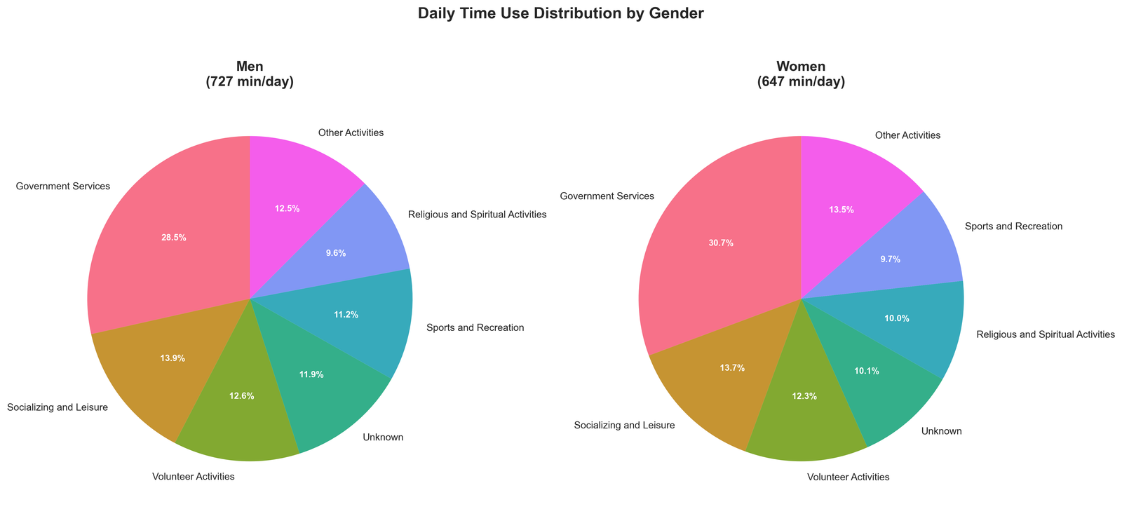
Figure 1. Daily time-use distribution by gender. The displayed totals are 727 minutes per day for men and 647 minutes per day for women.
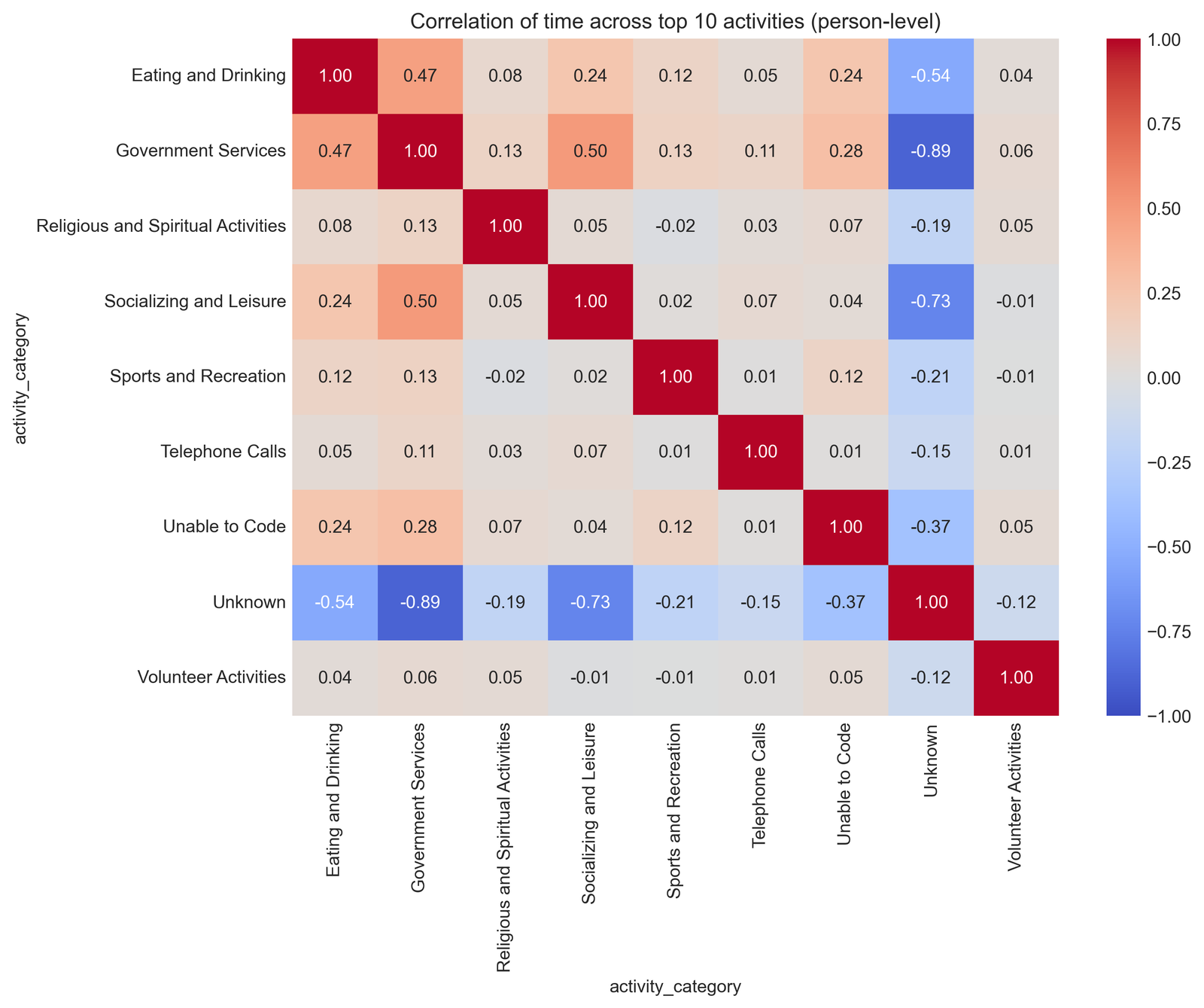
Figure 2. Person-level correlation matrix across the displayed activity categories, including Unknown and Unable to Code.
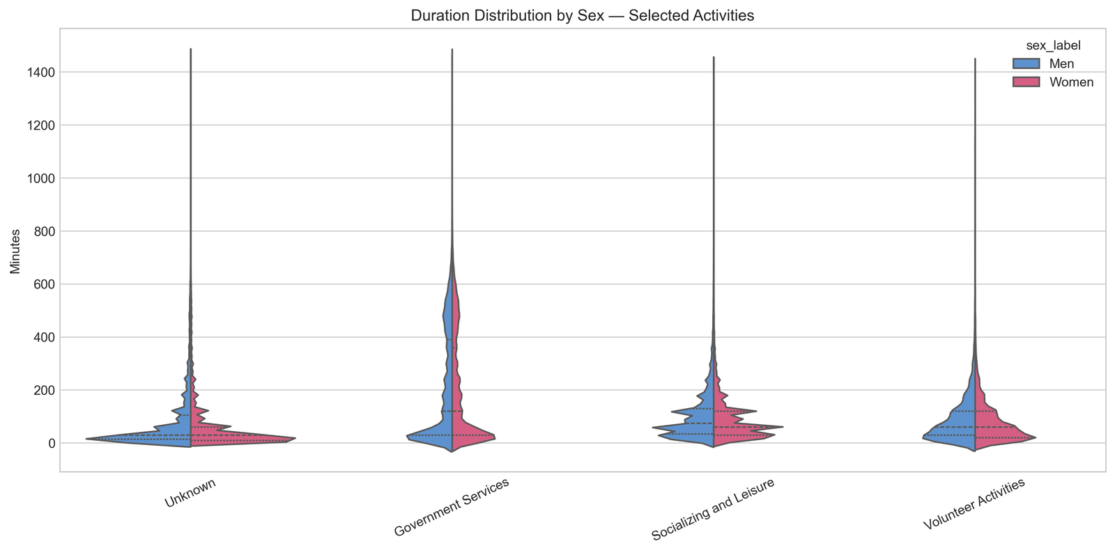
Figure 3. Duration distributions by sex for selected activities. The long tails show why averages need distributional context.
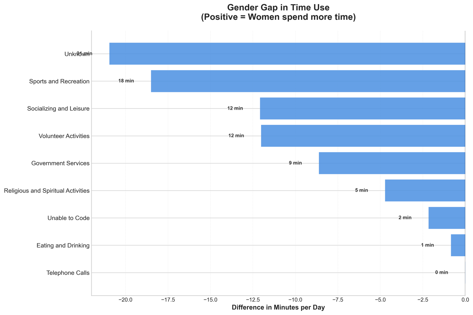
Figure 4. Gender gap in time use. The chart defines positive values as women spending more time.
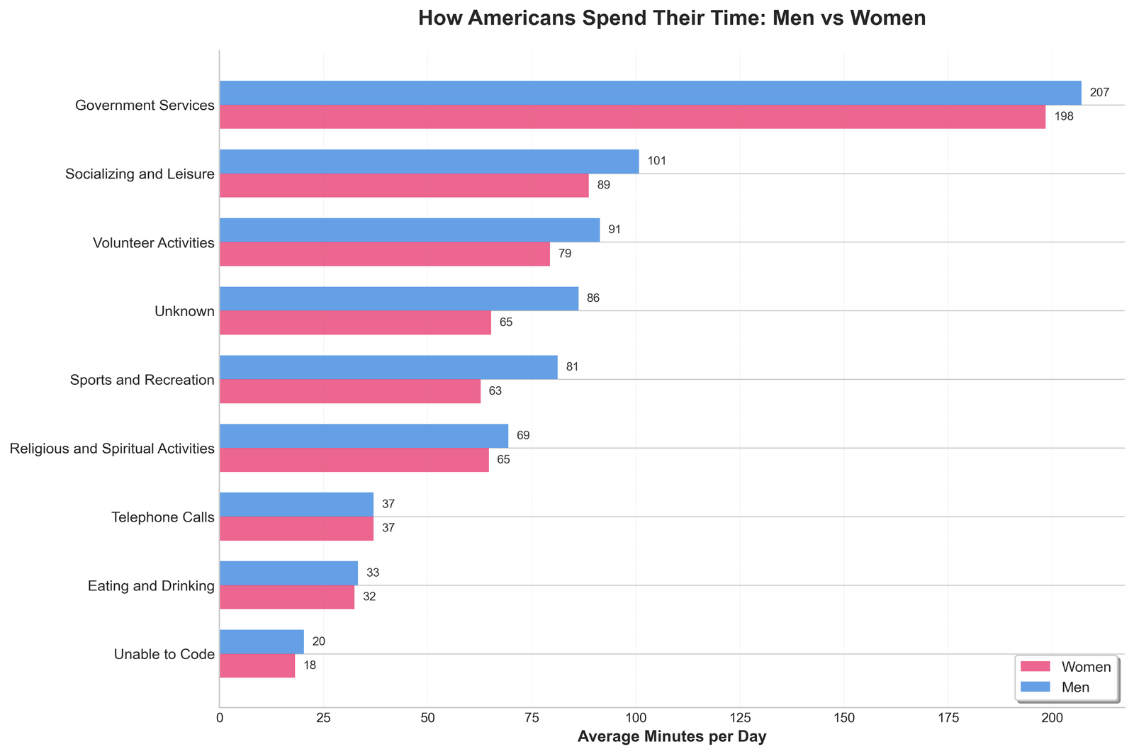
Figure 5. Average minutes by activity for men and women, including Unknown and Unable to Code in the displayed output.
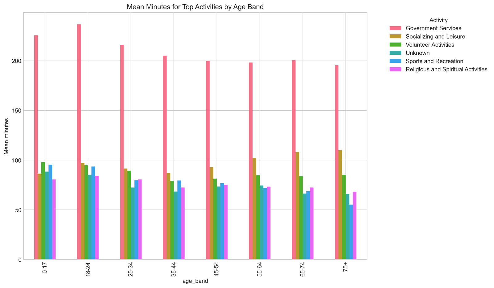
Figure 6. Mean minutes by age band across the displayed activity categories.
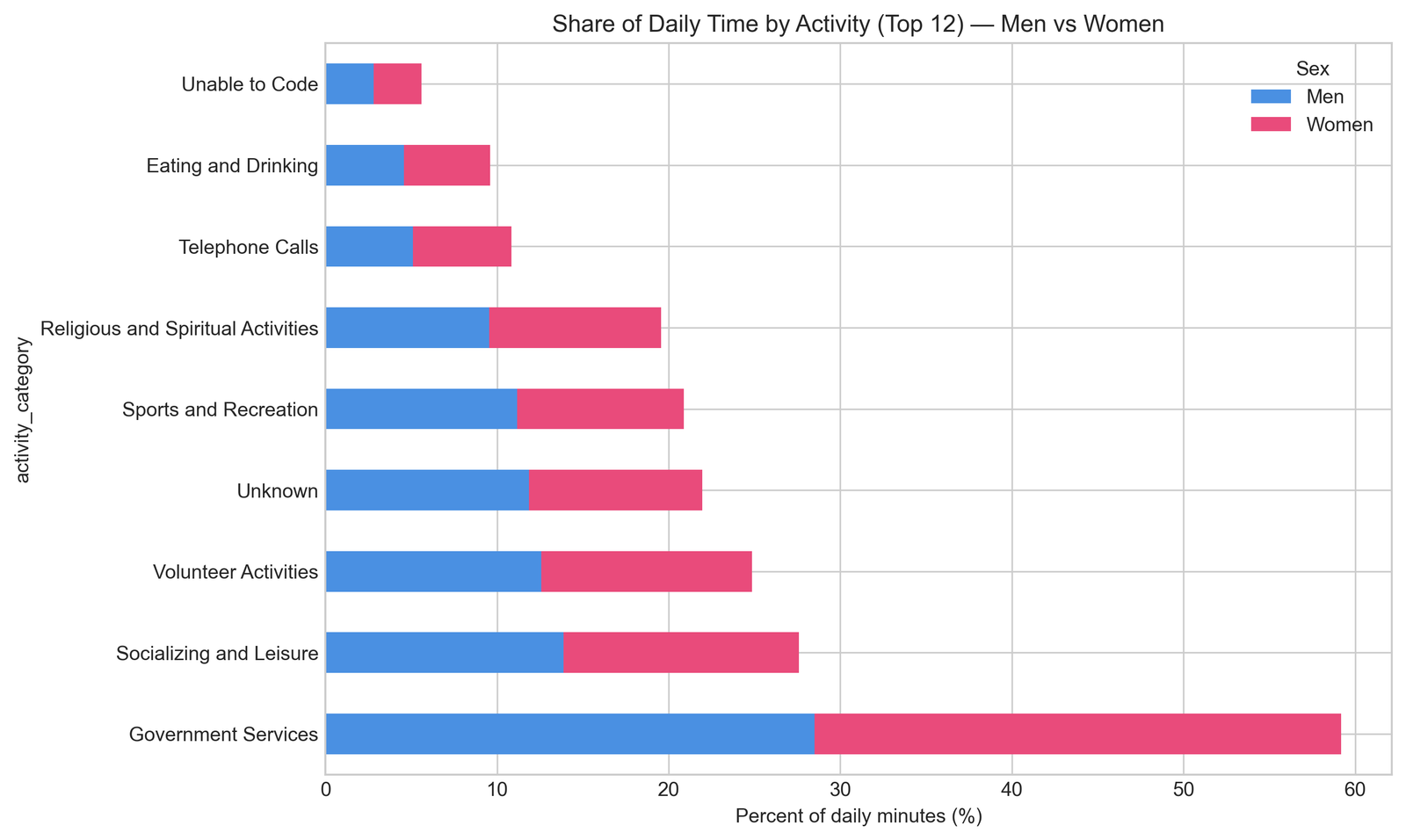
Figure 7. Share of daily time by activity for men and women.
What the project delivered
The project delivered a multi-year data layer, schema and key diagnostics, weighted and unweighted analysis tables, and a visual set that makes the underlying time-use patterns easier to discuss. The workflow is the kind of work covered by Python data-analysis help, where pandas, NumPy, Matplotlib, and Seaborn are used to turn tabular data into documented results.
- A repeatable download and extraction structure for yearly ATUS releases.
- A schema audit that makes year-to-year changes visible before analysis.
- Aligned CSV and Parquet tables for activity, respondent, roster, and who records.
- A join check with an explicit case-count result instead of an assumed relationship.
- Category summaries that preserve people with zero recorded minutes.
- Seven visual outputs that answer different questions about daily time use.
The lesson that transfers to other Python projects
Public datasets rarely arrive in the exact shape a chart expects. The strongest part of this project is the discipline of checking the data before interpreting it: inspect the releases, measure schema changes, validate the joins, preserve the denominator, and state which calculation produced each result.
That approach applies to health surveys, economic releases, education records, customer event logs, and any analysis that joins repeated files across years. The chart is the visible result. The trust comes from the work underneath it.
Students working on similar data-analysis assignments can review the related Python Data Science Homework Help page or visit the DoMyPythonHomework homepage.
Method note
The figures are descriptive outputs from an iterative analysis. Population filters, survey-weight mappings, and duration conversions remain part of the interpretation of an individual chart. This case study focuses on the engineering workflow and the visual questions the project explored.
Frequently asked questions
What dataset did the project use?
It used yearly American Time Use Survey files from 2003 through 2024, organized into activity, respondent, roster, and who table families.
Why was schema harmonization necessary?
The available columns changed across years. A union-schema approach preserved the observed fields while representing unavailable year-specific fields as nulls.
Why include people with zero minutes in a category?
A category average should represent the selected population, not only respondents who performed that activity. The person-year-category grid keeps zero-duration observations in the denominator.
What is the difference between an ordinary and weighted average?
An ordinary average gives each observed person equal influence. A weighted average uses the survey weight so the calculation reflects the survey design more closely when the correct year-specific weight is applied.
What does this project demonstrate?
It demonstrates how Python can turn changing multi-year public records into aligned tables, validated joins, meaningful categories, and visual explanations.
Who completed the technical workflow?
Samuel P., Python Expert, completed and documented the ingestion, join, category, and visualization workflow. The case study identifies the technical role without exposing the student’s name, university, or private project files.
How was the student’s privacy protected?
The case study uses a general description of the student and does not publish a name, university, assignment submission, grade, or personal quote. Only the project method and documented visual outputs are described.
Source and editorial note
The data source is the Bureau of Labor Statistics American Time Use Survey. The case study uses the project’s analysis outputs and does not claim a student grade, testimonial, client identity, or unsupported business result.
Related pages: Python Data Science Homework Help, Python Learning Resources, and the DoMyPythonHomework homepage.
Have a Python project like this one? We ship working code with a walkthrough.