Python Data Visualization Guide for Assignments
Contents · 46 sections
- Pick your library: matplotlib, seaborn, plotly, or pandas
- Pick your chart: match the plot to your data shape
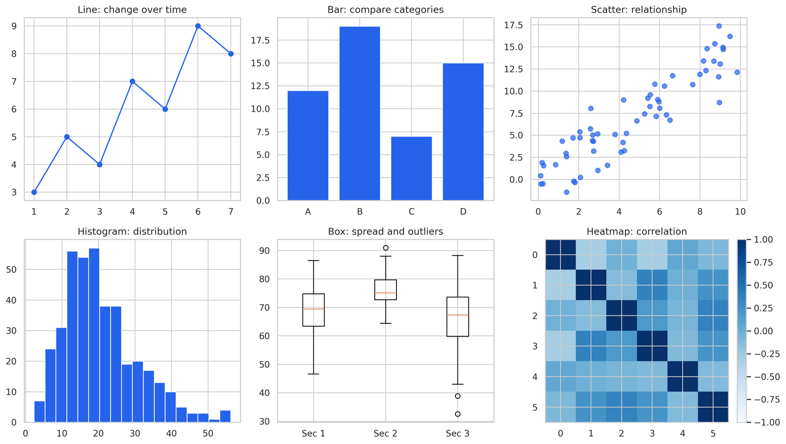
- Line chart shows change over time
- Bar chart compares categories
- Scatter plot shows the relationship between two numbers
- Histogram shows the distribution of one column
- Box plot shows spread and outliers
- Heatmap shows correlation across many columns
- matplotlib builds a chart in four steps
- Build a line chart with plot()
- Add a title, axis labels, and a legend
- Show the chart with plt.show()
- Save the chart with savefig()
- seaborn draws statistical plots in one line
- Plot a distribution with histplot()
- Plot a relationship with scatterplot()
- Plot categories with barplot()
- Compare every column pair with pairplot()
- plotly makes charts you hover and zoom
- Build an interactive line chart with plotly express
- Add color and size to a scatter plot
- Export a plotly chart to HTML or PNG
- pandas .plot() charts a DataFrame without extra code
- Plot one column against the index
- Plot grouped data after groupby
- Formatting earns marks on a lab report
- Label every axis with its unit
- Title every figure with what it shows
- Add a legend when a chart holds two or more series
- Export a figure for submission without a blank file
- Call savefig() before plt.show()
- Set dpi=300 for a crisp submission
- Choose PNG for raster, PDF for vector
- Fix a blank matplotlib figure and four other common errors
- A blank figure means plt.show() ran before the plot built
- Overlapping labels clear with plt.tight_layout()
- A saved figure comes out empty when savefig() runs after show()
- A missing chart in a script traces to no plt.show() at the end
- Wrong colors trace to a missing color argument
- Build a chart end to end: load, clean, plot, export
- Load the CSV with pandas
- Clean missing values in two lines
- Plot the cleaned data with seaborn
- Export the figure for submission
- Common questions about Python data visualization
- Stuck on a Python visualization assignment
A column of numbers tells you nothing at a glance. The same numbers in a line chart tell you the trend in two seconds. That gap is the whole reason data visualization exists, and it is why almost every data assignment past week three asks you to produce a chart, not just a table.
This guide covers the four tools that handle 95 percent of coursework: matplotlib for full control, seaborn for fast statistical plots, plotly for interactive charts, and pandas .plot() for a quick look without leaving your DataFrame. You get runnable code for each, a decision table for picking the right chart, the formatting details that earn marks on a lab report, and fixes for the blank-figure problem that wastes an hour for half the students who hit it.
I grade a lot of these assignments. The students who lose points rarely lose them on the analysis. They lose them on a missing axis label, a figure that saved blank, or a pie chart used where a bar chart belonged. Get those small things right and your charts read as the work of someone who knows what they are doing.
Pick your library: matplotlib, seaborn, plotly, or pandas
Pick the library by the job, not by habit. Each one fits a different situation, and using the wrong one turns a five-minute task into a thirty-minute fight.
| Library | Best for | Lines of code | Output |
|---|---|---|---|
| matplotlib | Full control over every element | More | Static |
| seaborn | Statistical plots with good defaults | Fewest | Static |
| plotly | Interactive charts for notebooks and web | Medium | Interactive |
| pandas .plot() | A fast look at a DataFrame | Fewest | Static |
matplotlib sits under the other three. seaborn draws on top of it, and pandas plotting calls it directly. So time spent learning matplotlib pays off everywhere else. Reach for seaborn when the chart is statistical, a distribution, a relationship, a category comparison, because the defaults look clean with no extra work. Reach for plotly when the assignment asks for an interactive chart or a dashboard. Reach for pandas .plot() during exploration, when you want to see the shape of a column before you commit to a polished figure.
One rule keeps your code calm: do not mix four libraries in one chart. Pick one per figure and finish it.
Pick your chart: match the plot to your data shape
Match the chart to the shape of your data, not to what looks impressive. A wrong chart type is the single most common reason a visualization assignment comes back marked down, and it is the easiest mistake to avoid.
Line chart shows change over time
A line chart connects points in order, so it fits anything measured across time or a continuous sequence. Stock prices by day, temperature by hour, model accuracy by epoch. The x-axis carries the ordered variable, the y-axis carries the value. Skip the line chart for unordered categories, because connecting "apples" to "oranges" with a line implies a trend that does not exist.
Bar chart compares categories
A bar chart compares a numeric value across separate groups. Sales by region, average score by class, count of students per major. The height encodes the number, and the eye compares heights well. This is the chart most pie charts wish they were.
Scatter plot shows the relationship between two numbers
A scatter plot puts one numeric variable on each axis and drops a dot for every row. It answers one question fast: as x goes up, what happens to y? Use it for height against weight, study hours against grade, ad spend against revenue. The shape of the cloud tells you the relationship.
Histogram shows the distribution of one column
A histogram bins one numeric column and counts how many values land in each bin. It answers where the data piles up, whether it is skewed, and whether it has one peak or two. Reach for it whenever a question asks about the distribution of a single variable.
Box plot shows spread and outliers
A box plot draws the median, the middle 50 percent of values, and the outliers in one compact shape. It shines when you compare the spread of one variable across several groups, like test scores across three sections. Five sections fit in the space a single histogram takes.
Heatmap shows correlation across many columns
A heatmap colors a grid by value, and its most common coursework use is a correlation matrix. Every numeric column appears on both axes, and the color of each cell encodes how strongly two columns move together. One glance surfaces the strong relationships in a dataset with twelve variables.
matplotlib builds a chart in four steps
matplotlib builds every chart from the same four steps: plot the data, label it, show it, save it. Learn the rhythm once and every later chart follows it.
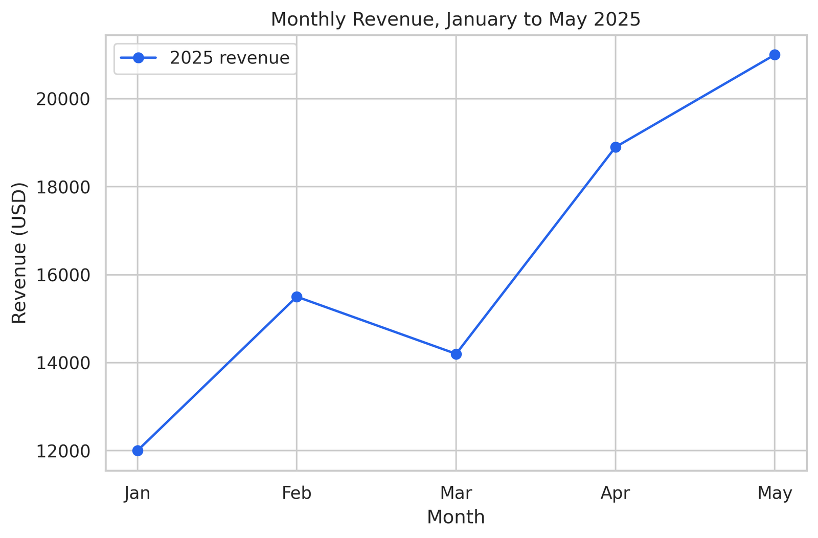
Build a line chart with plot()
Start with the data and one call to plot().
import matplotlib.pyplot as plt

months = ["Jan", "Feb", "Mar", "Apr", "May"]
revenue = [12000, 15500, 14200, 18900, 21000]

plt.figure(figsize=(8, 5))
plt.plot(months, revenue, marker="o", color="#2563eb")
plt.show()
figure(figsize=(8, 5)) sets the size in inches, which controls how the chart looks when it lands in a report. The marker="o" argument puts a dot on each data point, a small touch that makes individual values readable.
Add a title, axis labels, and a legend
Three lines turn a raw plot into something a grader reads without guessing.
plt.figure(figsize=(8, 5))
plt.plot(months, revenue, marker="o", color="#2563eb", label="2025 revenue")
plt.title("Monthly Revenue, January to May 2025")
plt.xlabel("Month")
plt.ylabel("Revenue (USD)")
plt.legend()
plt.show()
The label argument inside plot() feeds the legend. The unit in the y-axis label, USD, removes any question about what the numbers mean. This single block separates a chart that earns full marks from one that loses two points for "unlabeled axes."
Show the chart with plt.show()
plt.show() renders the figure. In a Jupyter notebook the chart appears under the cell. In a plain .py script run from a terminal, plt.show() opens a window and pauses the program until you close it. Leave it off in a script and the program ends before anything appears, which is the source of a very common "my code runs but no chart shows" message.
Save the chart with savefig()
savefig() writes the figure to a file for your submission.
plt.figure(figsize=(8, 5))
plt.plot(months, revenue, marker="o", color="#2563eb", label="2025 revenue")
plt.title("Monthly Revenue, January to May 2025")
plt.xlabel("Month")
plt.ylabel("Revenue (USD)")
plt.legend()
plt.savefig("revenue.png", dpi=300, bbox_inches="tight")
plt.show()
The order of the last two lines matters more than it looks. More on that in the export section, because the wrong order produces a blank file.
seaborn draws statistical plots in one line
seaborn produces a clean statistical chart from a DataFrame in a single line, with sensible defaults that take matplotlib several lines to match. It pairs naturally with pandas, so the column names you already have become the plot arguments.
Load a sample dataset once and reuse it across the examples.
import seaborn as sns
import matplotlib.pyplot as plt
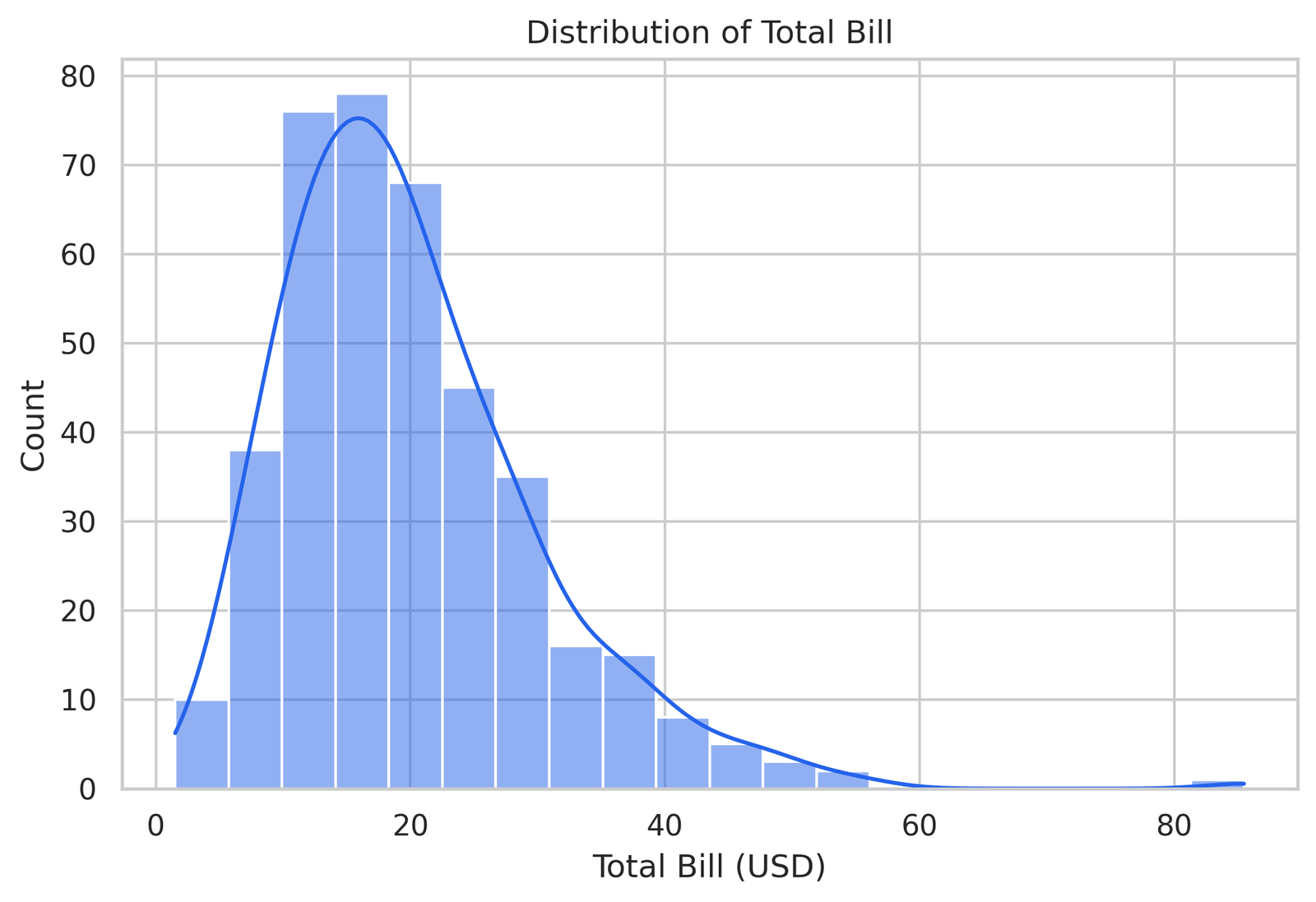
tips = sns.load_dataset("tips")Plot a distribution with histplot()
sns.histplot(data=tips, x="total_bill", bins=20, kde=True)
plt.title("Distribution of Total Bill")
plt.show()
histplot bins the column and counts the rows in each bin. The kde=True argument overlays a smooth curve that shows the distribution shape, which helps when the assignment asks whether the data is skewed.
Plot a relationship with scatterplot()
sns.scatterplot(data=tips, x="total_bill", y="tip", hue="time")
plt.title("Tip vs Total Bill by Time of Day")
plt.show()
The hue="time" argument colors the points by a third column, lunch against dinner here, so one chart answers two questions at once. That extra dimension is the kind of detail that reads as a stronger analysis.
Plot categories with barplot()
sns.barplot(data=tips, x="day", y="total_bill", estimator="mean")
plt.title("Average Total Bill by Day")
plt.show()
seaborn computes the mean of total_bill for each day on its own. The thin line on top of each bar is the confidence interval, a free statistical touch that matplotlib leaves to you.
Compare every column pair with pairplot()
sns.pairplot(tips, hue="time")
plt.show()
pairplot draws a scatter plot for every pair of numeric columns and a distribution down the diagonal. For an exploratory section of an assignment, this one line surfaces relationships across the whole dataset.
plotly makes charts you hover and zoom
plotly produces an interactive chart where the reader hovers for exact values, zooms into a region, and toggles series on and off. Use it when an assignment asks for an interactive figure or a dashboard, or when you publish the chart to a web page.
import plotly.express as px

gapminder = px.data.gapminder().query("year == 2007")
Build an interactive line chart with plotly express
df = px.data.stocks()
fig = px.line(df, x="date", y="GOOG", title="Google Stock Price, 2018 to 2019")
fig.show()
plotly.express builds a full interactive figure from one call. Hover over the line and the exact date and price appear in a tooltip, with no extra code.
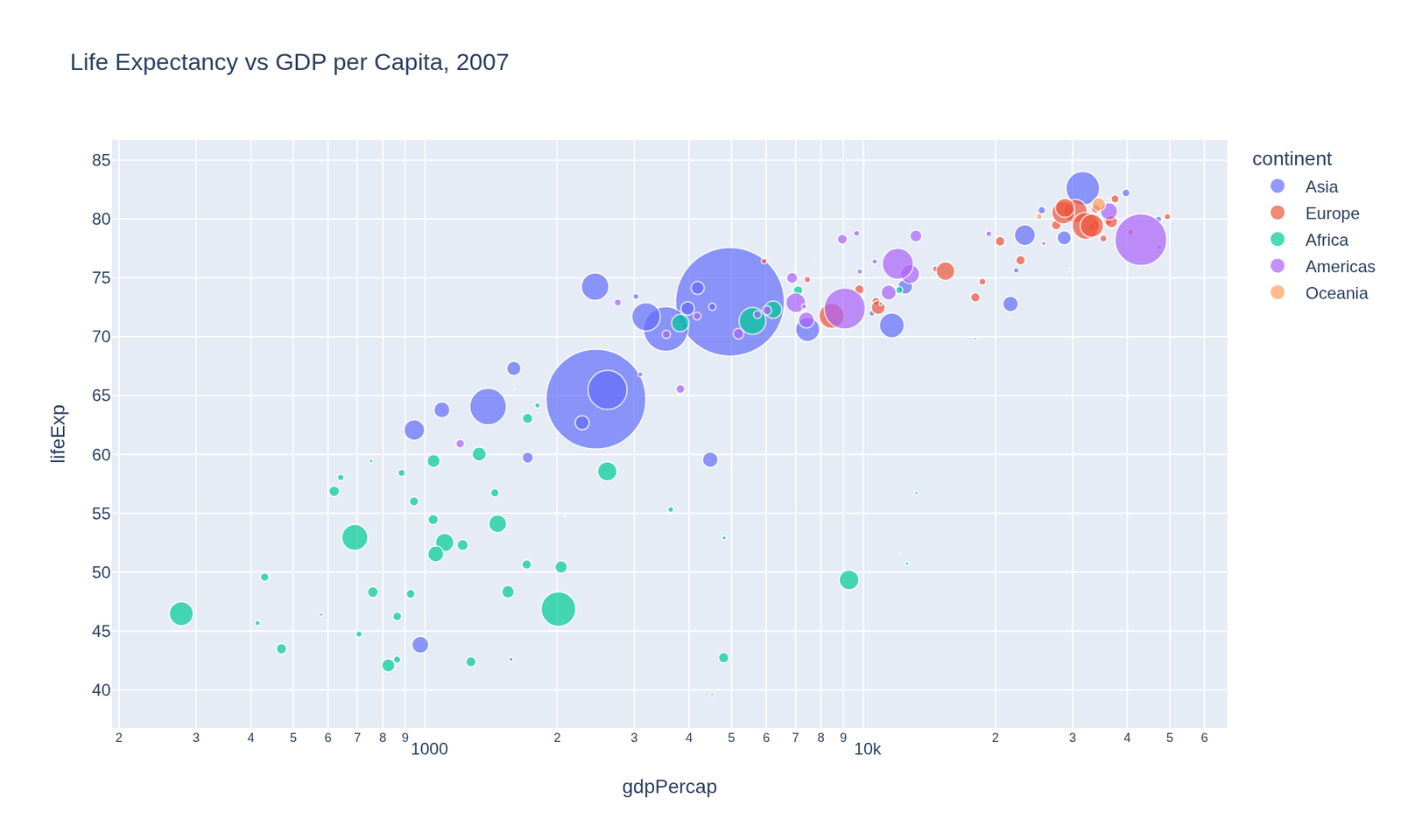
Add color and size to a scatter plot
fig = px.scatter(
    gapminder,
    x="gdpPercap",
    y="lifeExp",
    size="pop",
    color="continent",
    hover_name="country",
    log_x=True,
    title="Life Expectancy vs GDP per Capita, 2007",
)
fig.show()
This single chart encodes four variables. The x and y axes carry two, the bubble size carries population, and the color carries continent. hover_name="country" puts the country name in the tooltip, so the reader explores every point by hovering.
Export a plotly chart to HTML or PNG
fig.write_html("chart.html")
fig.write_image("chart.png")
write_html keeps the chart interactive in a file you submit or embed. write_image saves a static picture for a PDF report and uses the kaleido package, so install it first with pip install kaleido.
pandas .plot() charts a DataFrame without extra code
pandas plots a DataFrame straight from the data with .plot(), which calls matplotlib under the hood. This is the fastest way to see the shape of your data during cleaning and exploration, before you commit to a polished figure.
import pandas as pd
import matplotlib.pyplot as plt

data = {
    "month": ["Jan", "Feb", "Mar", "Apr", "May"],
    "revenue": [12000, 15500, 14200, 18900, 21000],
}
df = pd.DataFrame(data).set_index("month")
Plot one column against the index
df["revenue"].plot(kind="line", marker="o", figsize=(8, 5), title="Revenue by Month")
plt.ylabel("Revenue (USD)")
plt.show()
Setting month as the index puts it on the x-axis automatically. The kind argument switches the chart type, so kind="bar" gives a bar chart from the same line.
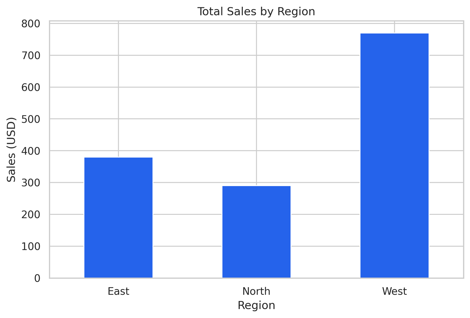
Plot grouped data after groupby
sales = pd.DataFrame({
    "region": ["East", "West", "East", "West", "North"],
    "amount": [200, 350, 180, 420, 290],
})

grouped = sales.groupby("region")["amount"].sum()
grouped.plot(kind="bar", figsize=(8, 5), title="Total Sales by Region")
plt.ylabel("Sales (USD)")
plt.xticks(rotation=0)
plt.show()
groupby followed by .plot() is the everyday pattern for a coursework chart. The xticks(rotation=0) call keeps the region labels horizontal so they stay readable.
Formatting earns marks on a lab report
Formatting is where assignment points hide. The analysis behind two charts gets the same grade, and then one loses points because nothing on the axis says what the numbers mean. Three habits close that gap.
Label every axis with its unit
A bare number on an axis raises a question. A labeled axis answers it. "Revenue" tells the reader the topic, "Revenue (USD)" tells them the unit, and the unit is the part students forget. Temperature in Celsius, time in seconds, distance in kilometers. Put the unit in parentheses every time.
plt.xlabel("Time (seconds)")
plt.ylabel("Distance (meters)")
Title every figure with what it shows
A title states what the chart shows and, where it matters, the time range. "Monthly Revenue, January to May 2025" beats "Revenue" because the reader knows the scope before reading a single bar. A grader scanning ten figures relies on titles to follow your argument.
Add a legend when a chart holds two or more series
Two lines on one chart without a legend force the reader to guess which is which. Pass a label to each series and call plt.legend().
plt.plot(months, revenue_2024, label="2024")
plt.plot(months, revenue_2025, label="2025")
plt.legend()
A single series needs no legend, and adding one there just clutters the chart. Match the legend to the data.
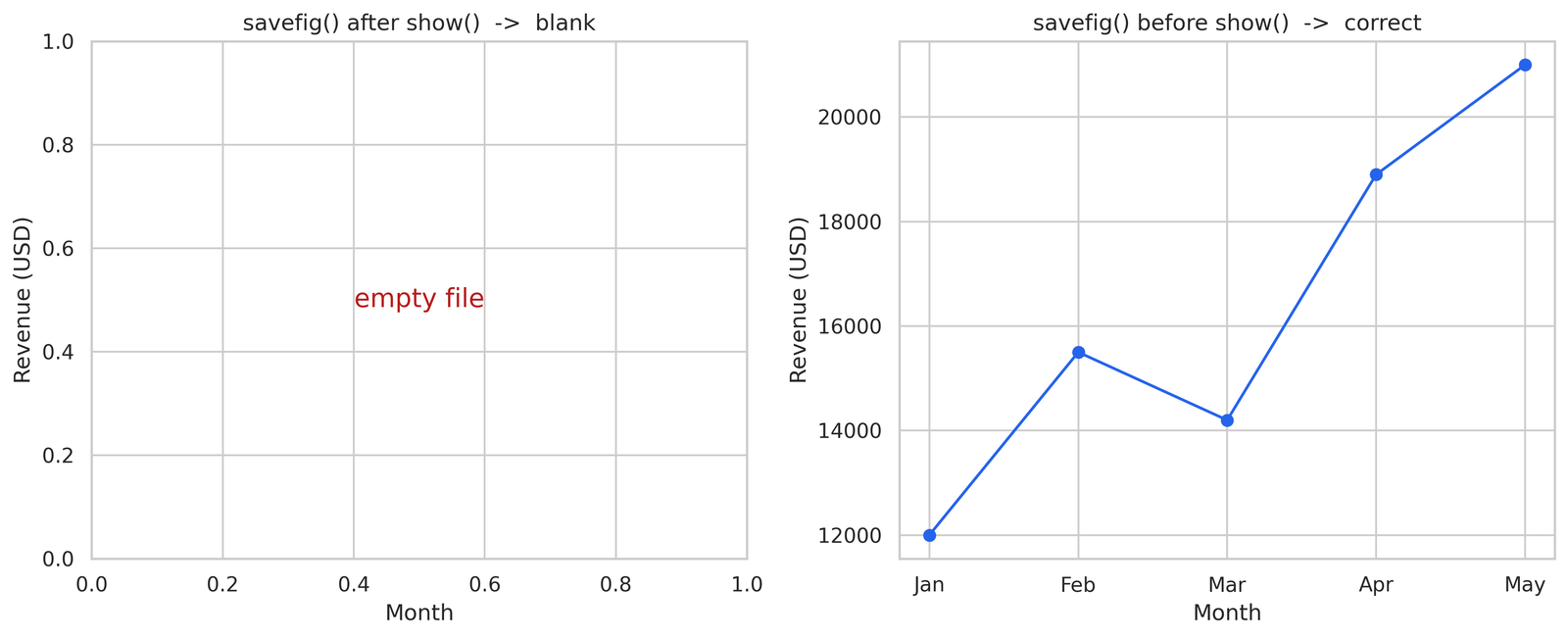
Export a figure for submission without a blank file
A figure saves blank for one reason almost every time: savefig() ran after plt.show(). Fix the order and three other export details, and your submitted file matches what you saw on screen.
Call savefig() before plt.show()
plt.show() clears the current figure after it displays. Call savefig() afterward and it saves an empty canvas. The order that works:
plt.savefig("chart.png", dpi=300, bbox_inches="tight")
plt.show()
Save first, show second. This one swap accounts for most blank-file submissions I see.
Set dpi=300 for a crisp submission
dpi controls resolution. The default of 100 looks soft when a grader zooms in or prints the report. dpi=300 produces a sharp image at print quality, and the file stays small enough to upload.
plt.savefig("chart.png", dpi=300, bbox_inches="tight")bbox_inches="tight" trims the extra whitespace around the figure so the chart fills the saved image.
Choose PNG for raster, PDF for vector
PNG saves a pixel image, which fits a chart embedded in a document or a notebook. PDF and SVG save vector graphics that stay sharp at any zoom, which fits a chart printed in a formal report. Pick PNG for everyday submissions and PDF when the assignment asks for print quality.
Fix a blank matplotlib figure and four other common errors
A blank or broken figure traces to one of five causes, and each has a one-line fix. Work through them in order and the chart appears.
A blank figure means plt.show() ran before the plot built
An empty window means the plotting calls came after plt.show(), or no plotting call ran at all. Build the chart first, call plt.show() last. In a notebook, a stray plt.show() in an earlier cell clears the figure, so keep one figure per cell while you debug.
Overlapping labels clear with plt.tight_layout()
Long x-axis labels crowd into each other and turn unreadable. plt.tight_layout() recalculates the spacing so labels fit.
plt.tight_layout()
plt.show()
For long category names, rotate them too with plt.xticks(rotation=45).
A saved figure comes out empty when savefig() runs after show()
This is the export version of the blank-figure problem. The chart looks right on screen and the saved file is empty, because show() cleared the figure before savefig() ran. Move savefig() above plt.show().
A missing chart in a script traces to no plt.show() at the end
A script that runs clean and shows nothing is missing plt.show(). A notebook renders the last figure on its own, so code copied from a notebook into a .py file loses its chart. Add plt.show() as the final line.
Wrong colors trace to a missing color argument
A chart that ignores the color you set usually has the color in the wrong place. In matplotlib the color goes inside the plotting call, plt.plot(x, y, color="red"), not in a separate statement. In seaborn, use palette for a categorical color set and color for a single shade.
Build a chart end to end: load, clean, plot, export
A real assignment runs four steps in order: load the data, clean it, plot it, export the figure. Here is the full sequence on a small dataset, the same flow a grader expects to see.
Load the CSV with pandas
import pandas as pd

df = pd.read_csv("scores.csv")
print(df.head())
print(df.info())
head() shows the first five rows so you confirm the file loaded correctly. info() shows the column types and the count of non-null values, which flags missing data before it breaks a plot.
Clean missing values in two lines
df = df.dropna(subset=["score"])
df["score"] = df["score"].astype(float)
dropna removes rows with a missing score, and the type conversion guards against a column that loaded as text. A chart built on dirty data shows gaps or throws an error, so this step comes before plotting every time.
Plot the cleaned data with seaborn
import seaborn as sns
import matplotlib.pyplot as plt

plt.figure(figsize=(8, 5))
sns.barplot(data=df, x="subject", y="score", estimator="mean")
plt.title("Average Score by Subject")
plt.xlabel("Subject")
plt.ylabel("Score (out of 100)")
plt.tight_layout()
Export the figure for submission
plt.savefig("average_score.png", dpi=300, bbox_inches="tight")
plt.show()
That sequence, load, clean, plot, export, is the backbone of nearly every data visualization assignment. Master it once and the topic of the dataset stops mattering, because the steps stay the same.
For the cleaning side of this flow in more depth, see Python Data Analysis. When the data feeds a model, Machine Learning with Python picks up where this leaves off.
Common questions about Python data visualization
Which Python library is best for data visualization? matplotlib for full control, seaborn for fast statistical plots, and plotly for interactive charts. Most coursework uses seaborn for the chart and matplotlib for the finishing touches, because seaborn draws on top of matplotlib.
What is the difference between matplotlib and seaborn? matplotlib gives you control over every element and takes more lines to reach a clean result. seaborn sits on top of matplotlib and produces a polished statistical chart from a DataFrame in one line. You often use both together, seaborn for the plot and matplotlib for the title and labels.
How do you plot a pandas DataFrame?
Call .plot() on the DataFrame or a column, like df["revenue"].plot(kind="line"). The kind argument switches between line, bar, hist, box, and more. pandas plotting calls matplotlib underneath, so matplotlib styling works on the result.
Why is my matplotlib plot blank?
The plotting calls ran after plt.show(), or no plotting call ran. Build the chart first and call plt.show() last. A saved file that comes out blank has the same cause: move savefig() above plt.show().
How do you save a Python chart as an image?
Call plt.savefig("chart.png", dpi=300, bbox_inches="tight") before plt.show(). Use dpi=300 for print quality and PNG for an embedded image or PDF for a vector file.
Which chart type fits my data? Line for change over time, bar for category comparison, scatter for the relationship between two numbers, histogram for the distribution of one column, box plot for spread across groups, and heatmap for correlation across many columns.
Stuck on a Python visualization assignment
A chart that refuses to render the night before a deadline is a different problem from learning the syntax. For an assignment with a rubric and a clock, talk through it with a Python expert before you commit, on Data Science Homework Help. You see who handles the work and agree on the approach first.
Stuck on a Python assignment? We ship working code with a walkthrough.