Predicting Cost of Living in Python: A Machine Learning Project
Contents · 26 sections
- What the assignment asked the project to solve
- The dataset in numbers
- Loading and checking the CSV in Python
- Selecting the 10-city study group
- Cleaning outliers and duplicates
- Creating a cost-of-living target and derived features
- Adding time and city information
- Exploring trends and relationships
- Selecting features with mutual information and RFE
- Using PCA to view the cost factors
- Expanding the features before model training
- Keeping later years for validation and testing
- Comparing the regression models
- Reading the residual plots
- What the results prove, and what they do not prove
- The unfinished 2030 projection block
- A cleaner production pattern for the next version
- What a student can learn from this project
- Questions students often ask about this workflow
- Is this a time-series project or a regression project?
- Why use a log-transformed target?
- Why does XGBoost perform best in the supplied comparison?
- Does the R² of 0.9964 mean the model is perfect?
- Why does the notebook use both PCA and polynomial features?
- Can the supplied notebook produce a finished 2030 city forecast?
- Final project takeaway
A student-focused walkthrough of a Jupyter Notebook project using city cost data, feature engineering, PCA, model tuning, and time-based evaluation.
Project type: Python machine learning assignment and data visualization
Related help: Machine Learning Homework Help
Student privacy: The student’s name, university, grade, and deadline are not published.
This project uses Python to estimate cost of living from rent, food, gas, healthcare, utilities, transportation, salary, education, and tax-rate fields. The supplied dataset contains 5,000 records from 30 cities covering 2010 to 2025. The notebook narrows the analysis to 10 cities, builds derived affordability features, compares several regression models, and selects XGBoost as the strongest model in the supplied run.
The useful part of this project is the full workflow. A student can see how a data science assignment moves from a written brief to a cleaned CSV, an exploratory analysis, a validation design, a tuned model, and a set of plots that explain the result. If you are working through a similar Python data science brief, python programming assignment help can help you decide which part of the workflow needs attention.
If the brief combines data cleaning, statistical analysis, and prediction, our data science homework help page is a relevant starting point. It is best to identify the exact stage causing difficulty before asking for help, rather than treating the whole project as one undefined problem.
What the assignment asked the project to solve
The brief asked for a data science project about the cost of living in the world’s most populated cities. The stated goal was to compare living-cost factors and predict future cost of living. The marking criteria focused on both the code and the explanation around it:
- explain the problem and why it matters;
- load the data correctly in a Jupyter Notebook;
- prepare the variables for machine learning;
- split the observations into training, validation, and test sets;
- use methods covered in class;
- tune and compare models with suitable evaluation measures;
- evaluate the selected model on data held out from training;
- explain limitations and sensible improvements.
The brief also listed topics such as z-scoring, correlation, vector representations, distance metrics, K-nearest neighbors, Naive Bayes, PCA, K-means, Gaussian mixture models, DBSCAN, and genetic algorithms. The supplied notebook’s final executable path concentrates on regression, feature selection, PCA, and model comparison. The presentation mentions additional methods that do not appear in the notebook’s final model-selection output, so this article describes the runnable notebook rather than presenting every slide topic as an implemented result.
For students planning a large assignment, a Python homework workflow that separates the brief, the working code, the evidence, and the final explanation is worth building alongside a project like this one.
The dataset in numbers
The local CSV contains 5,000 rows and 11 columns. It has 30 city names, years from 2010 through 2025, and no missing values in the supplied copy.
| Item | Value from the supplied files |
|---|---|
| Rows in the source CSV | 5,000 |
| Columns | 11 |
| Cities in the source CSV | 30 |
| Year range | 2010 to 2025 |
| Selected cities | 10 |
| Modeling rows after filtering | 3,000 |
| Rows per selected city | 300 |
| Final target used by the notebook | Log_Cost_of_Living |
The notebook filters these cities: Guangzhou, Tokyo, Shanghai, Delhi, Dhaka, Cairo, Mumbai, Beijing, Sao Paulo, and Lagos. Each selected city contributes 300 records. That balanced count makes the city comparison easier to read, although it does not mean that every city has the same quality or economic coverage in the source data.
The columns represent monthly or point-in-time cost measures, income, education cost, and tax rate. The field named Education(Privacy) appears in the raw data and is carried through the notebook as written. Because the supplied project files do not include a data dictionary, a publishable version of the analysis must explain the intended meaning and unit for each field before treating the numbers as official economic statistics. The presentation describes the dataset as a Kaggle dataset, but the notebook loads a local CSV, so the original citation belongs in the final submission’s references.
Loading and checking the CSV in Python
The first useful checkpoint is simple: confirm that the notebook reads the expected file and inspect its shape before applying transformations.
import pandas as pd

df = pd.read_csv("Cost_of_Living_TimeSeries.csv")

print("Dataset shape:", df.shape)
print(df.head())
print(df.isnull().sum())
The supplied run reports a shape of (5000, 11). Every column has zero missing values, so the notebook does not need to impute any records for this copy. The notebook still contains a median and mode imputation branch. That is a useful safety check because the same workflow can handle a revised CSV without silently failing when a value is absent.
The exploratory summary also shows that the source spans 16 years. The dataset has multiple rows for the same city and year, which means the notebook is working with repeated observations rather than one single official annual value per city.
Selecting the 10-city study group
The notebook uses an explicit list instead of assuming that the first 10 cities in the file are the correct cities. That makes the scope visible in the code.
top_10_cities = [
    "Guangzhou", "Tokyo", "Shanghai", "Delhi", "Dhaka",
    "Cairo", "Mumbai", "Beijing", "São Paulo", "Lagos"
]

filtered_df = df[df["City"].isin(top_10_cities)].copy()
filtered_df = filtered_df.sort_values(["City", "Year"])
The result is 3,000 rows. Sorting by city and year matters because the next stage creates lag variables. Without a stable order, a previous-row calculation can connect the wrong observations.
Cleaning outliers and duplicates
The supplied notebook uses the interquartile range to inspect numeric columns. It calculates the first quartile, third quartile, and IQR, then counts values beyond the usual 1.5 IQR boundary. It also defines a wider 3 IQR boundary for extreme values and caps extreme observations when they represent less than 1 percent of the filtered data.
for col in numeric_cols:
    q1 = filtered_df[col].quantile(0.25)
    q3 = filtered_df[col].quantile(0.75)
    iqr = q3 - q1

    extreme_lower = q1 - 3 * iqr
    extreme_upper = q3 + 3 * iqr
    filtered_df[col] = filtered_df[col].clip(
        lower=extreme_lower,
        upper=extreme_upper
    )
This choice is easy to explain to a student audience: the project keeps the main shape of the data while limiting the effect of extreme values. It also needs a sentence about context. A very high rent value may be a genuine expensive observation, not a mistake. Capping is a modeling decision, not proof that the original record was wrong.
The duplicate check reports zero duplicate rows in the supplied run. That result belongs in the project report because it explains why no records were removed at this stage.
Creating a cost-of-living target and derived features
The notebook constructs a target called Cost_of_Living by adding rent, food, gas, healthcare, utilities, and transportation. It then creates a log-transformed target for modeling.
filtered_df["Cost_of_Living"] = (
    filtered_df["Rent"]
    + filtered_df["Food(Monthly)"]
    + filtered_df["Healthcare(Monthly)"]
    + filtered_df["Utilities(Monthly)"]
    + filtered_df["Transportation(Monthly)"]
    + filtered_df["Gas Prices"]
)

filtered_df["Log_Cost_of_Living"] = np.log1p(
    filtered_df["Cost_of_Living"]
)
The normality test in the notebook reports a p-value of 0.000000 for the untransformed target. The log transform gives the regression models a less skewed target to learn. It also changes the meaning of the metrics: the final RMSE and MAE are measured in log-target units, not dollars or another currency.
The feature-engineering stage adds several variables:
Disposable_Income, calculated from salary and tax rate;Affordability_Index, calculated as disposable income divided by monthly food cost;Income_to_Tax_Ratio;Housing_to_Income_Ratio;Income_Squared;Tax_Income_Interaction;Housing_Health_Interaction;- previous-year cost and income fields;
- cost and income growth rates.
These features give the models more context than a list of raw columns. A ratio such as rent divided by salary asks a different question from rent alone. A lag feature asks whether the previous cost level helps explain the next observation.
One naming detail deserves attention. The notebook calls one feature Total_Cost_Percentage, but the supplied code adds rent, healthcare, education, and transportation without dividing by salary or multiplying by 100. In this run, it behaves as a combined cost amount, not a percentage. The article keeps the original variable name so the code and screenshots remain traceable, but students should rename or correct that formula in a revised submission.
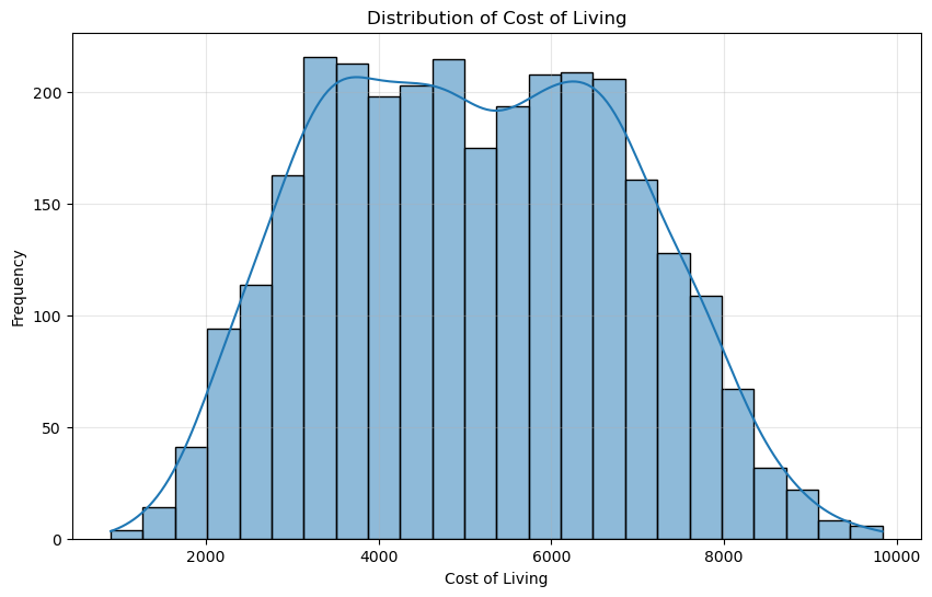
Figure 1. The constructed cost-of-living target has a broad distribution before the log transformation.
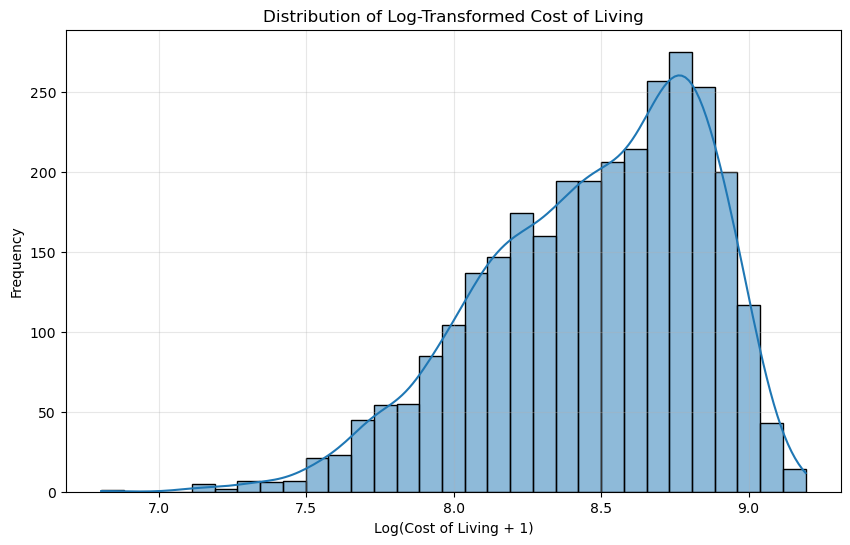
Figure 2. The log transform gives the model a compressed target scale and changes the interpretation of error values.
Adding time and city information
The notebook creates previous-year and growth features after sorting by city and year.
filtered_df["CoL_Previous_Year"] = (
    filtered_df.groupby("City")["Cost_of_Living"].shift(1)
)
filtered_df["CoL_Growth"] = (
    filtered_df["Cost_of_Living"]
    / filtered_df["CoL_Previous_Year"]
) - 1

filtered_df[[
    "CoL_Previous_Year", "CoL_Growth"
]] = filtered_df[[
    "CoL_Previous_Year", "CoL_Growth"
]].fillna(0)
For the first record in each city, there is no previous observation. The notebook fills that missing lag with zero. That makes the matrix usable, but zero means “not available” here, not “the previous cost was zero.” A stronger production version would keep a missing-value indicator or remove the first observation in each city from lag-based analyses.
The city column is then converted into one-hot columns such as City_Cairo, City_Delhi, and City_Tokyo. One-hot encoding lets a regression model use city identity without treating city names as ordered numbers.
Exploring trends and relationships
The notebook produces several charts before model training. The city trend plot places all 10 selected cities on the same time axis. The lines are busy because the source contains repeated rows for each city-year combination, but the chart still gives the reader a direct view of variation across the study group.
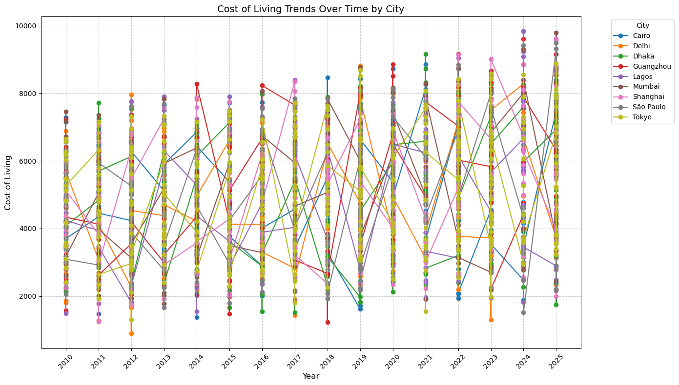
Figure 3. Cost-of-living observations by city and year in the filtered dataset.
The overall yearly average rises from about 4,435 in 2010 to about 5,800 in 2025 in the supplied run. That line is a descriptive summary of this dataset, not a claim about a global cost-of-living index.
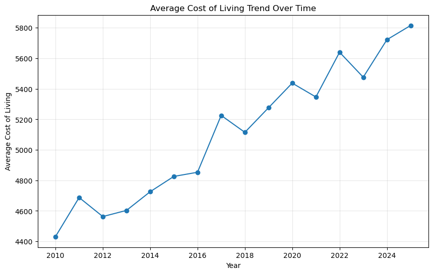
Figure 4. The yearly mean increases across the supplied study period, with several year-to-year reversals.
The correlation matrix helps the student explain related variables before choosing a model. It includes the raw numeric fields and several engineered fields. Correlation is useful for inspection, but it does not prove that one economic variable causes another.
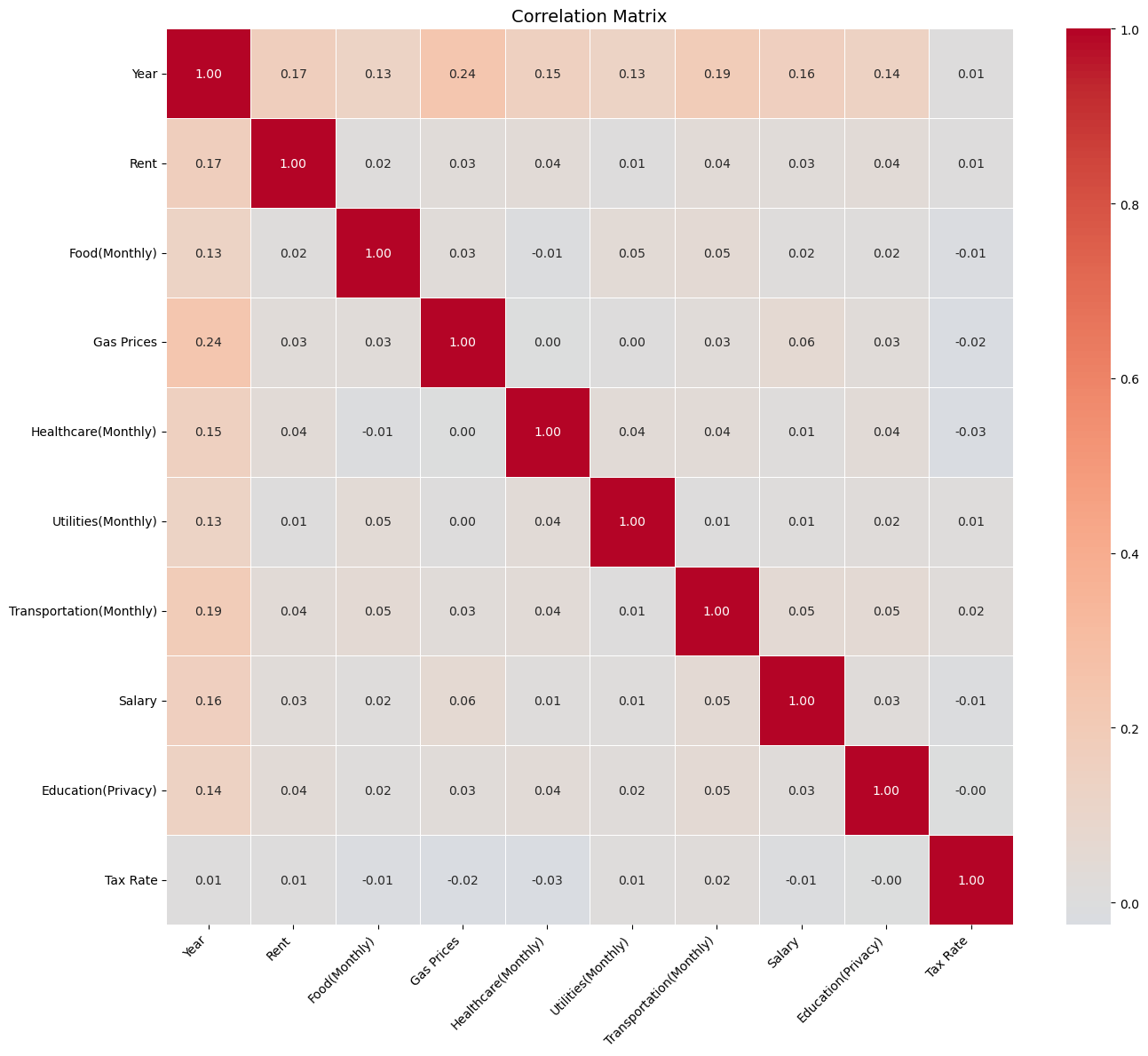
Figure 5. Correlation analysis gives context for feature selection and multicollinearity checks.
The notebook’s multicollinearity check reports no severe pairwise correlation above its selected threshold. That result belongs beside the feature-engineering formulas because derived variables can still create a target that is mathematically close to the inputs used to build it.
Selecting features with mutual information and RFE
The notebook uses two different feature-selection ideas. Mutual information measures how much information a feature provides about the target, including relationships that are not strictly linear. Recursive feature elimination uses a Random Forest estimator to rank variables and keep a selected number of features.
The mutual-information output places these features at the top of the supplied run:
| Feature | Mutual-information score |
|---|---|
| Rent | 1.053329 |
| Total_Cost_Percentage | 0.619951 |
| Housing_Health_Interaction | 0.579911 |
| CoL_Growth | 0.414429 |
| Housing_to_Income_Ratio | 0.334337 |
The two selection methods produce 17 unique features after duplicates are removed. The notebook then uses RobustScaler, which centers each feature around its median and scales it using the interquartile range. That choice reduces the influence of unusual values during scaling.
If the difficult part is preparing a CSV, creating derived columns, or keeping Pandas transformations readable, students can also review our Pandas homework help page before moving on to model selection.
Using PCA to view the cost factors
PCA compresses the 17 selected features into two components for visualization. In the supplied run, the first component explains 40.05 percent of the scaled variance and the second explains 14.44 percent. Together they account for about 54 percent of the variation in the selected feature set.
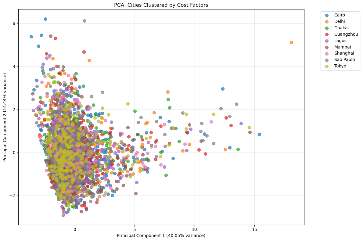
Figure 6. PCA reduces the selected feature space to two axes for a visual comparison of city observations.
PCA is used here as an exploratory view, not as the final prediction model. A crowded central region means many observations share similar combinations of scaled cost and affordability features. A few points sit farther away from the main cloud, which makes them useful candidates for checking rather than automatically deleting.
Expanding the features before model training
The notebook expands the 17 scaled features into degree-two polynomial terms:
poly = PolynomialFeatures(
    degree=2,
    include_bias=False,
    interaction_only=False
)
X_poly = poly.fit_transform(X_scaled)
print(X_scaled.shape[1])
print(X_poly.shape[1])
The feature count rises from 17 to 170. The new matrix contains squared terms and pairwise interactions. This gives linear models access to curved relationships, while tree models can already represent many nonlinear patterns without the same expansion.
Keeping later years for validation and testing
The final modeling path uses a time-based split rather than mixing every year randomly. The notebook assigns:
- training: 2010 to 2021, 2,280 observations;
- validation: 2022 to 2023, 371 observations;
- test: 2024 to 2025, 349 observations.
years = sorted(filtered_df["Year"].unique())
train_years = years[:-4]
val_years = years[-4:-2]
test_years = years[-2:]

train_mask = filtered_df["Year"].isin(train_years)
val_mask = filtered_df["Year"].isin(val_years)
test_mask = filtered_df["Year"].isin(test_years)

X_train, y_train = X[train_mask], y_array[train_mask]
X_val, y_val = X[val_mask], y_array[val_mask]
X_test, y_test = X[test_mask], y_array[test_mask]
This design follows the direction of the prediction task: older observations train the model, recent observations help tune it, and the latest years provide the final check. It is more informative for a time-oriented problem than a single random split.
Comparing the regression models
The notebook tunes and evaluates several regression choices. The supplied validation output is:
| Model | Validation RMSE | Validation R² |
|---|---|---|
| XGBoost Regression | 0.015542 | 0.998193 |
| Random Forest | 0.022402 | 0.996246 |
| KNN Regression | 0.044555 | 0.985152 |
The Ridge cell reports a validation RMSE of 0.0198 and an R² of 0.9971. The Linear Regression baseline reports an R² of 0.9636, although that cell uses a separate random 80/20 split, so it is a baseline reference rather than a perfectly matched comparison with the time-based models.
XGBoost wins the supplied validation comparison. Its selected settings are 200 estimators, a learning rate of 0.1, maximum depth 3, subsampling of 0.8, and a column-sampling rate of 0.8.
Students who are comparing regressors, tuning parameters, or interpreting validation metrics can use our machine learning homework help page as a related next step.
xgb = XGBRegressor(
    objective="reg:squarederror",
    random_state=42
)

grid = {
    "n_estimators": [100, 200],
    "learning_rate": [0.05, 0.1],
    "max_depth": [3, 5],
    "subsample": [0.8],
    "colsample_bytree": [0.8]
}

xgb_grid = GridSearchCV(
    xgb,
    grid,
    cv=3,
    scoring="neg_mean_squared_error",
    n_jobs=-1
)
xgb_grid.fit(X_train, y_train)
The final test output for the selected XGBoost model reports an RMSE of about 0.02, an MAE of about 0.02, an R² of 0.9964, and a mean relative error of 0.20 percent. Because the target is Log_Cost_of_Living, those figures describe performance on the transformed target. They do not mean that the model predicts a city’s currency cost within two cents.
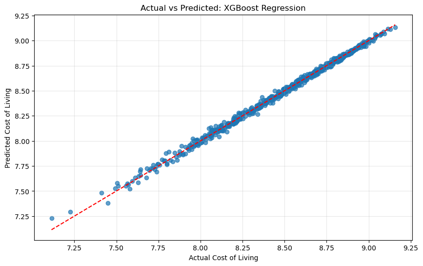
Figure 7. The predictions sit close to the diagonal reference line in the supplied test output.
Reading the residual plots
Residuals are the differences between the observed target and the prediction. The residual plot places most points around zero, and the residual histogram is concentrated near zero with a small number of wider errors.
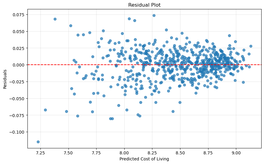
Figure 8. Residuals are centered near zero, with wider errors at the lower end of the prediction range.
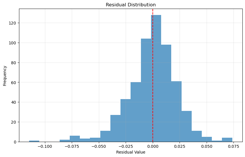
Figure 9. The residual distribution is concentrated around zero in the supplied run.
These plots support the model evaluation, but they do not remove the need to inspect the data design. A model can score highly when the target is created directly from the same input variables. The next section explains why that distinction matters.
What the results prove, and what they do not prove
The supplied notebook demonstrates a complete educational machine learning workflow. It proves that the selected models can reconstruct the engineered log target for the held-out rows under the chosen split. It does not prove that the model can forecast official future living costs for every city.
There are four reasons for that careful wording:
- The target is a direct sum of several input cost fields. The model receives many of those same fields as predictors, so the task is partly a reconstruction problem.
- Feature selection, scaling, PCA, and polynomial expansion are fitted before the time split in the supplied notebook. A cleaner evaluation fits these transformations on training data only, preferably inside a scikit-learn
Pipeline. - The raw
Gas Pricesvalue is added to monthly cost fields without a unit conversion. The resulting target mixes quantities that may not be directly comparable. - The very low RMSE is measured on the log target. It cannot be translated into a currency error without converting predictions back with
np.expm1and evaluating on the original scale.
Those points do not make the project useless. They give a student a clear discussion for the limitations section and show how a classroom model can be improved before it is used for a real forecasting decision.
The unfinished 2030 projection block
The notebook prints Projecting cost of living for year 2030 and contains code intended to create one future row per city using a simple 2 percent annual growth assumption. The supplied run does not produce a final 2030 comparison table. By the time that block runs, the original City column has already been replaced by one-hot columns, and the future-prediction dictionary also expects a features key that is not present in the selected-feature fallback.
That is a useful debugging lesson. The forecast section needs a named feature frame that uses the same columns and transformations as the training data. A clean fix keeps the original city label in a separate column, builds future assumptions for each city, re-creates the engineered variables, applies the fitted scaler, and then passes the columns in the exact training order.
The 2030 code is therefore best described as a planned extension, not as a completed result. The article does not invent city-level 2030 numbers that the supplied output does not show.
A cleaner production pattern for the next version
A revised notebook can preserve the same project idea while tightening the evaluation. A pipeline keeps preprocessing tied to the training fold:
from sklearn.pipeline import Pipeline
from sklearn.preprocessing import RobustScaler
from sklearn.model_selection import TimeSeriesSplit, GridSearchCV
from xgboost import XGBRegressor

pipeline = Pipeline([
    ("scale", RobustScaler()),
    ("model", XGBRegressor(
        objective="reg:squarederror",
        random_state=42
    ))
])

params = {
    "model__n_estimators": [100, 200],
    "model__max_depth": [3, 5],
    "model__learning_rate": [0.05, 0.1]
}

search = GridSearchCV(
    pipeline,
    params,
    cv=TimeSeriesSplit(n_splits=3),
    scoring="neg_root_mean_squared_error"
)
search.fit(X_train, y_train)
This pattern avoids fitting the scaler on future observations. It also makes the training and prediction path easier to reproduce when a new CSV is added.
Before calling the project a real city-cost forecast, a revised version can:
- document the dataset source, currency, units, and collection method;
- separate annual and monthly quantities before calculating a total;
- build the target from a justified definition rather than adding incompatible scales;
- fit feature selection and transformations inside the training workflow;
- keep raw feature names after polynomial expansion;
- report both log-scale metrics and original-scale currency metrics;
- use rolling or expanding-window validation;
- compare a simple city-by-city baseline with the global model;
- complete and test the 2030 scenario generator;
- avoid calling a combined cost sum a percentage.
What a student can learn from this project
This project is useful because it shows the decisions between the code cells, not just a final score. A student can follow how the expert:
- turned a broad question into a measurable regression target;
- checked the input file before modeling;
- selected a defined study group instead of filtering silently;
- built domain features for affordability and growth;
- used PCA as a visual aid rather than confusing it with prediction;
- reserved recent years for validation and testing;
- tuned more than one model;
- compared RMSE and R² together;
- inspected actual-versus-predicted values and residuals;
- recorded limitations instead of presenting one metric as proof of universal accuracy.
That last point matters. A useful data science report explains where the result is reliable and where the assumptions stop.
Questions students often ask about this workflow
Is this a time-series project or a regression project?
It is a regression project with time-aware data preparation. The notebook sorts by city and year and uses a time-based train, validation, and test split, but the final estimator is XGBoost regression rather than a dedicated ARIMA or LSTM model.
Why use a log-transformed target?
The notebook uses np.log1p after the normality test reports a very small p-value for the untransformed target. The transform compresses large values and gives the models a smoother target scale. Evaluation must state that the reported errors are log-scale values.
Why does XGBoost perform best in the supplied comparison?
XGBoost can model nonlinear relationships and interactions in the engineered features. In the supplied validation output, it has the lowest RMSE and highest R² among the stored comparison models. That result belongs to this dataset, feature set, split, and parameter grid.
Does the R² of 0.9964 mean the model is perfect?
No. It means the model explains most variation in the held-out transformed target under this experiment. The target is constructed from several predictor fields, and preprocessing is fitted before the split, so a revised leakage-controlled experiment may produce a lower and more realistic score.
Why does the notebook use both PCA and polynomial features?
PCA helps visualize the feature space in two dimensions. Polynomial features expand the input matrix for model training. They serve different purposes, and the PCA chart is not the input used for the final XGBoost comparison.
Can the supplied notebook produce a finished 2030 city forecast?
Not in its current saved run. It reaches the projection-year message but does not display a completed city comparison table. The future-data block needs the city labels and feature names to remain aligned with the training matrix.
Final project takeaway
The strongest part of this Python project is its traceable path from raw CSV to evaluated model. It loads 5,000 rows, narrows the study to 10 cities, creates affordability and time features, reduces the feature space for inspection, compares tuned regressors, and tests XGBoost on the most recent years.
The strongest report does one more thing: it distinguishes a high score on an engineered classroom target from a reliable economic forecast. That distinction turns the notebook into a useful learning resource. Students can see the working code, understand the plots, and also learn which assumptions deserve a second pass before the model is used beyond the assignment.
If you are building a similar notebook and need help understanding the code, feature engineering, validation split, or report structure, visit our python programming assignment help page and describe the part of the project that is blocking you.
Stuck on a Python assignment? We ship working code with a walkthrough.